Colours
WHAT'S ON THIS PAGE?
Brand Colours
Passion Red
PRS Passion Red
Pantone 185c
#e80033
R: 232 G: 0 B: 51
C: 0 M: 94 Y: 78 K: 0
Lime Green
PRS Lime Green
Pantone 2290c
#b7f200
R: 184 G: 242 B: 0
C: 45 M: 0 Y: 90 K: 0
Midnight Blue
PRS Midnight Blue
Pantone 2766c
#020f47
R: 3 G: 15 B: 71
C: 100 M: 100 Y: 40 K: 25
Purple
PRS Purple
Pantone 2089c
#720ad8
R: 115 G: 10 B: 217
C: 80 M: 80 Y: 0 K: 0
Electric Blue
PRS Electric Blue
Pantone 2388c
#1949d3
R: 26 G: 74 B: 212
C: 100 M: 60 Y: 0 K: 0
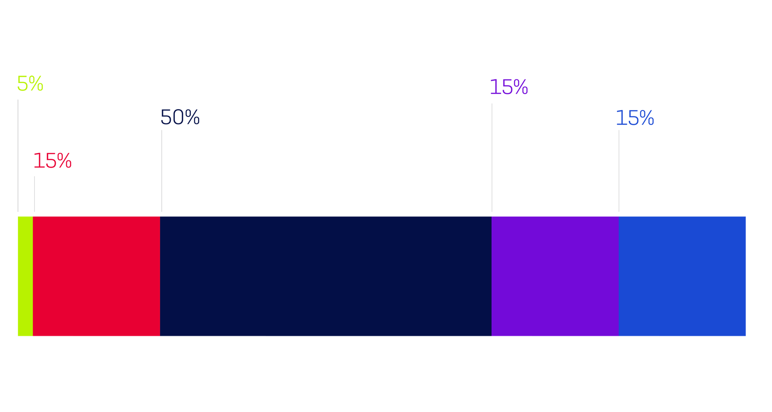
Colour Ratios
To ensure brand harmony, our colours should be used in the following approximate ratios within page layouts and designs. Note that this page is intended as a guide only and discretion by the designer is advised and expected as always. Remember, these colour ratios work relative to the appropriate amount of white space required by the specific application.
Colour ratios - Tints
Where appropriate, the brand colours may also by used in certain tints e.g. online use and tables.
Colour Gradient
Music is all about experience so a flat, lifeless environment wouldn’t reflect what we do. That’s why we created our gradient, to give life and substance to our brand. The gradient can be used as a background or to add impact to applications when photography is not appropriate or possible. It is supplied as an EPS/jpeg and can be cropped or flipped to suit your needs, just make sure that both colours are visible.